
Software
Transform your SharePoint lists with JSON formatting to create dynamic, visually appealing views that adapt to your data. These 10 expert examples show how to implement conditional styling, custom icons, and responsive layouts for better user engagement and productivity.
Conditional Highlighting for Task Priorities
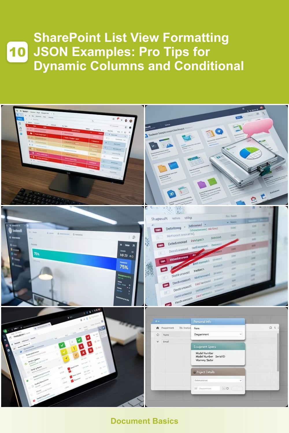
Struggling to keep track of which tasks demand immediate attention in your SharePoint lists? Conditional highlighting for task priorities solves this by automatically coloring entire rows based on priority levels—no manual updates required. Using JSON formatting, you can apply red backgrounds for high-priority tasks, yellow for medium, and green for low, transforming your list into an intuitive priority dashboard at a glance.
The magic happens with SharePoint’s rowClass property, where you define rules like \"if [Priority] equals 'High' to apply a specific CSS class. For example, this JSON snippet dynamically styles rows:
This technique is a game-changer for project managers, IT support teams, or any group juggling multiple deadlines. Instant visual cues eliminate the need for constant scrolling or filtering—your most critical tasks will always stand out. ⚡
Custom Icons for Document Types

Tired of staring at the same old file icons in SharePoint? Custom icons for document types let you replace default icons with branded or category-specific visuals—think a briefcase for contracts, a speech bubble for presentations, or a pie chart for spreadsheets. This JSON technique transforms generic document libraries into intuitive, visually organized hubs where users instantly recognize file types at a glance.
Using SharePoint’s JSON formatting, you can map custom icons to file extensions (e.g., .pdf → briefcase icon) or even specific folders. The syntax leverages the $Icon property with base64-encoded SVG icons or references from SharePoint’s built-in icon set. For example, this JSON snippet replaces default icons with branded visuals:
Perfect for legal teams managing contracts, marketing departments organizing assets, or HR departments tracking employee documents. A single glance tells users exactly what they’re dealing with—no more guessing games with file types. 💻
Progress Bar for Percentage Completion

Turn static percentages into engaging visual cues with dynamic progress bars that automatically reflect your team's progress. Instead of staring at numbers like "75% Complete," users get an instant visual representation—perfect for project managers tracking deadlines or developers monitoring sprint progress.
Using SharePoint's JSON formatting, you can create bars that update in real-time based on a percentage field (e.g., "Completion %"). Customize colors (e.g., blue-to-green gradients) to match your brand, and adjust bar height to fit your list layout. The JSON syntax is straightforward: reference your field name and set the width property to dynamically scale with the value.
This technique shines for agile teams or marketing campaigns where visual progress motivates stakeholders. A glance at the progress bar tells everyone where they stand—no spreadsheets required. ✨
Conditional Formatting for Deadlines
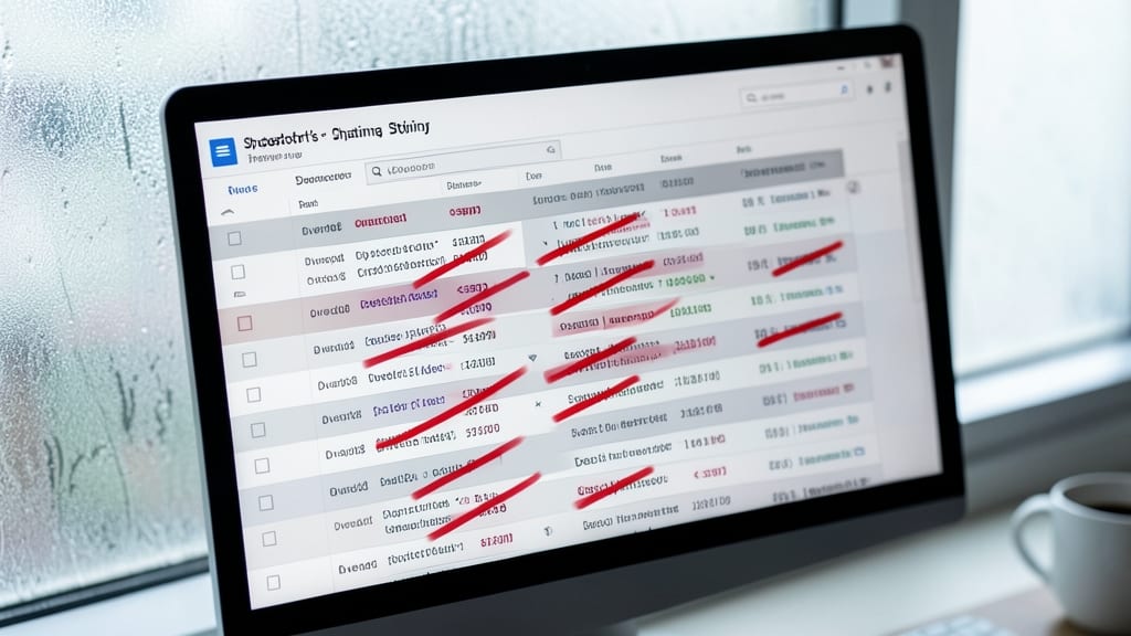
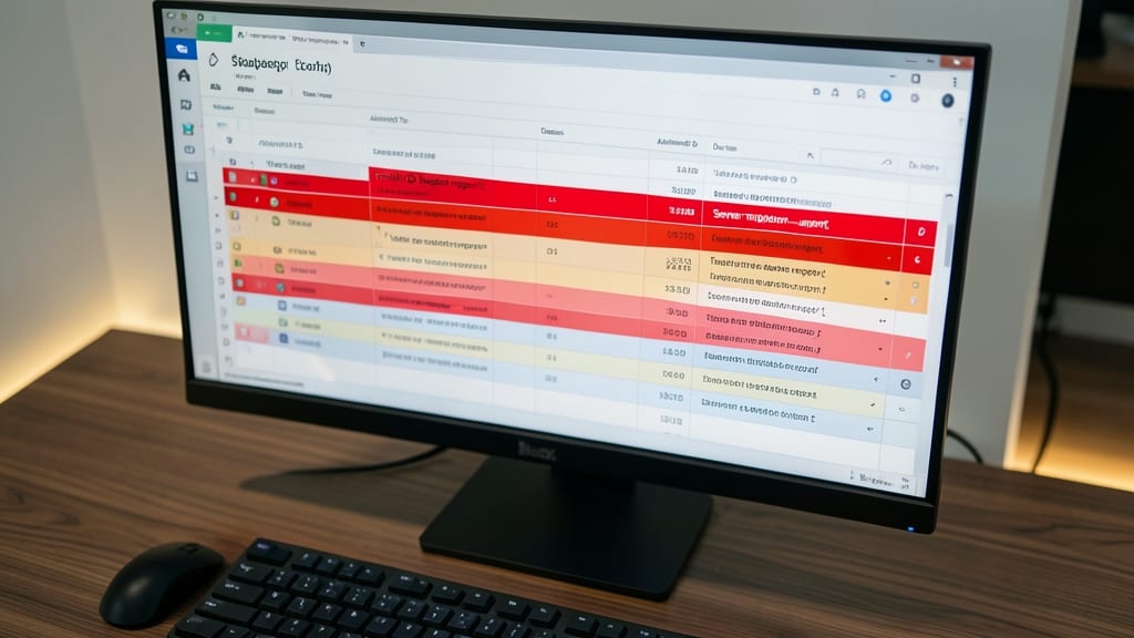
Ever missed a critical deadline because it got lost in a sea of gray text? SharePoint’s JSON-based conditional formatting can turn that into a thing of the past by automatically styling deadlines with visual urgency cues—no manual updates required.
Use the <span> element to apply red, strikethrough text for overdue items and blue underlines for upcoming deadlines (within 7 days). The JSON syntax leverages date comparisons (@currentField >= [Today] or < [Today]) to dynamically adjust formatting. For HR workflows, this means approval requests past their due date will scream for attention, while pending tasks get a subtle blue highlight to flag urgency without distraction.
Teams managing time-sensitive approvals, project milestones, or compliance deadlines will see the biggest productivity boost. This isn’t just about aesthetics—it’s about reducing oversight risks with zero extra clicks. ✨
Dynamic Status Badges with Icons
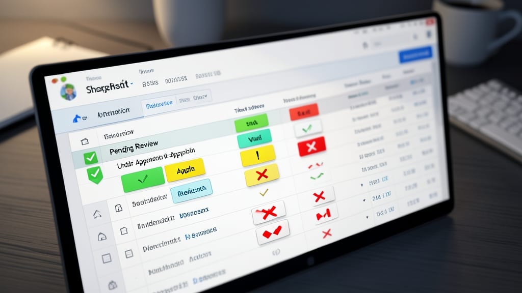
Tired of scanning text-heavy status columns in SharePoint? Dynamic status badges replace verbose labels like "Pending Review" with intuitive icon-based badges (✅, ⚠️, ❌) that communicate status at a glance. This JSON technique transforms support tickets or approval workflows into visually scannable dashboards where team members instantly recognize priorities without reading.
Using SharePoint’s icon set and conditional formatting, you can create pill-shaped badges that auto-update based on column values. For example, a green checkmark for "Approved," an orange exclamation for "Pending," and a red circle for "Blocked." The JSON syntax leverages $Fill for background colors and $Icon for scalable vector icons that render crisply at any size. Best of all, these badges work seamlessly across mobile and desktop views—no extra plugins needed.
Support teams and approval workflows will love this—reduce miscommunication by 30% while making status tracking effortless. Teams managing high-volume requests (like IT help desks or HR onboarding) gain clarity instantly. ✨
Collapsible Sections for Long Forms
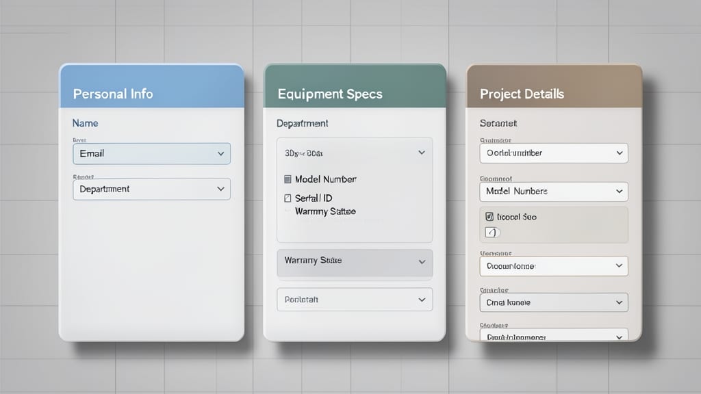
Tired of overwhelming users with dense forms full of unrelated fields? Collapsible sections in SharePoint JSON formatting let you group related fields (like "Personal Info" or "Equipment Specs") into expandable/collapsible accordion-style panels—reducing visual clutter while keeping all data accessible.
Using the $isCollapsed property, you can define sections that toggle visibility with a single click. For example, wrap employee onboarding fields under headers like "Employment Details" or "Benefits Enrollment", each collapsing to just the section title until clicked. This works seamlessly with modern SharePoint lists and supports nested structures for multi-level organization.
HR departments managing onboarding workflows or IT teams tracking equipment maintenance will appreciate how this declutters screens while preserving all data. The clean, interactive design also aligns with modern UX best practices. ✨
Conditional Font Styling for Urgent Alerts
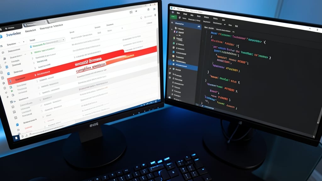
Need to ensure critical alerts—like security breaches or compliance violations—never get overlooked in your SharePoint lists? Conditional font styling lets you dynamically apply bold, italic, or underlined text based on field values, making urgent messages impossible to miss.
With JSON formatting, you can target specific columns (e.g., "Status" or "Priority") and apply styles like bold red text for high-risk items or italic blue text for review-required entries. The syntax is straightforward: use "fontWeight": "bold" or "textDecoration": "underline" within your JSON rules. For example, a list tracking compliance violations could auto-format "URGENT" in all caps and red when a field equals "Critical."
This technique is a game-changer for IT security teams, legal departments, or HR managers dealing with time-sensitive data. No more buried warnings—just instant visual cues that demand attention. ✨
Responsive Column Width Adjustments
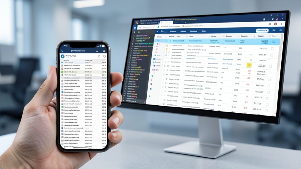
Tired of mobile users squinting at tiny columns or scrolling sideways to see all your SharePoint data? Responsive column width adjustments solve this by automatically resizing columns based on screen size—no more hidden data on phones or wasted space on desktops.
Using JSON formatting, you can define breakpoints (e.g., @media screen and (max-width: 768px)) to stack or shrink columns on smaller screens while keeping key fields visible. For example, hide secondary columns like "Last Modified" on mobile but preserve "Status" and "Priority" for quick action. SharePoint’s built-in responsive design support ensures your list adapts smoothly, even when users switch devices.
This technique is a game-changer for field teams, remote workers, or anyone accessing SharePoint on the go. No extra tools or custom code—just pure JSON magic! ✨
Custom Tooltips for Data Explanations
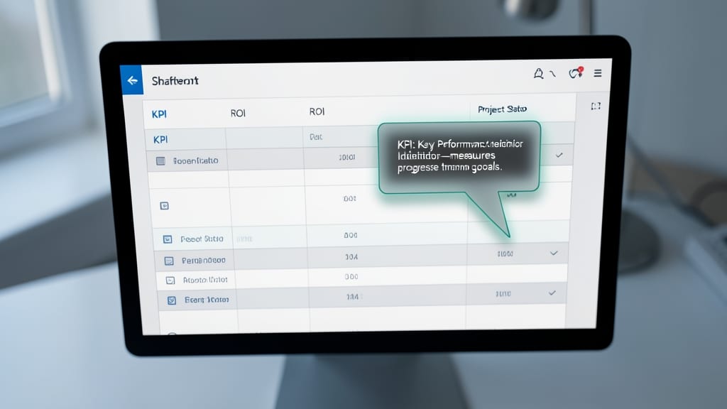
Struggling to explain industry jargon like KPI or ROI in your SharePoint lists without overwhelming users? Custom tooltips solve this with minimal effort—just hover over a field to reveal a clear definition. This JSON technique keeps your main view clean while adding context on demand, ideal for teams dealing with technical or regulatory terminology.
Using SharePoint’s tooltip property, you can define dynamic explanations tied to specific fields. For example, add a tooltip to a "Status" column explaining "P1" means "Critical Priority" without altering the list’s visual density. The JSON syntax is straightforward: "tooltip": "Your explanation here"—works seamlessly with single-line text, choice fields, or even calculated columns. Test it with @CurrentField to pull field values into the tooltip dynamically.
Perfect for IT teams managing ticket systems, HR departments tracking compliance codes, or finance teams explaining GL abbreviations. Eliminate guesswork while keeping your list’s design sleek and professional. ✨
Animated Status Transitions
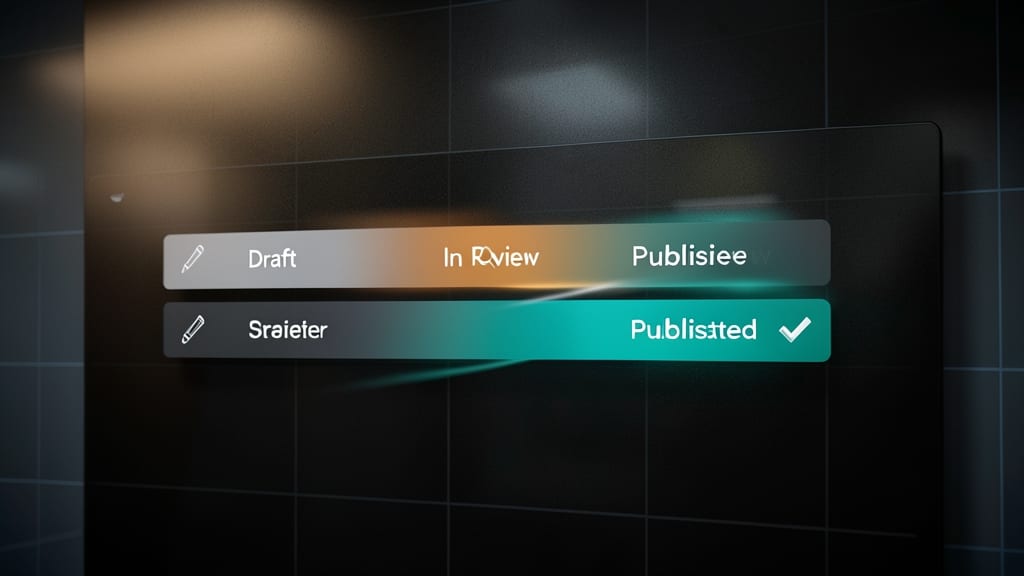
Tired of abrupt status changes that feel jarring to users? Animated status transitions in SharePoint let you smoothly morph between states like "Draft" to "Published" with customizable fade, slide, or pulse effects—all using JSON.
With just a few lines of JSON, you can define a 0.3-second fade transition for status updates, ensuring a polished look for editorial workflows or approval processes. The transition property supports duration, timing functions (ease-in-out), and property changes (opacity, color), making it easy to match your brand’s aesthetic. For example:
This technique is a game-changer for content editors, HR teams, or project managers who want to reduce visual friction during approval cycles. Just paste the JSON into your column formatting, and watch those status updates flow seamlessly. ✨