
Operating System
Dull spreadsheets and static reports won’t cut it in today’s data-driven world. These 10 creative financial data visualization techniques transform complex numbers into intuitive, actionable insights that engage stakeholders and accelerate decision-making.
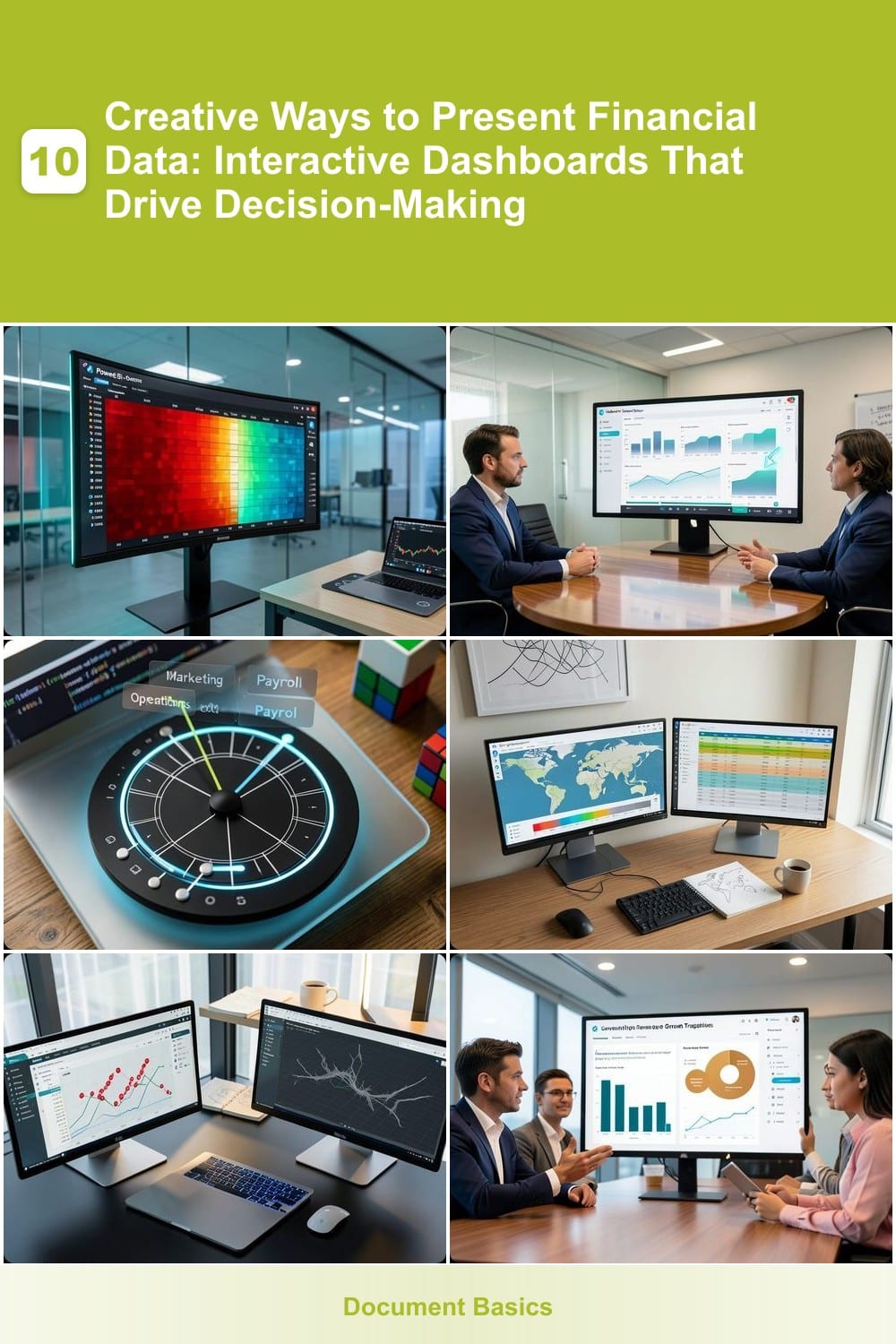
Real-Time Stock Market Heatmaps with Power BI
If you’ve ever watched a stock ticker scroll across your screen and wished for a clearer picture of market movements, Power BI’s real-time heatmaps turn raw data into an intuitive visual language. These dynamic tools update every few seconds, using color gradients to instantly show volatility—red for spikes, blue for dips—so you can spot trends before they become headlines.
The magic happens with Power BI’s built-in stock connectors (like Yahoo Finance or Alpha Vantage) paired with DAX measures for custom volatility calculations. You can overlay technical indicators (e.g., moving averages) or add interactive tooltips to reveal exact values on hover. For traders, the live refresh feature (as fast as 1-minute intervals) makes it feel like you’re trading in real time, not staring at stale numbers.
This is the go-to tool for day traders, portfolio managers, and financial analysts who need to react instantly to market shifts. Whether you’re tracking sector performance or monitoring a single stock’s momentum, the heatmap’s simplicity hides its power—no PhD in economics required. ⚡
Animated Financial Forecasting with Tableau Stories

Board meetings don’t need to be a data death march. Tableau Stories turns multi-year financial projections into engaging, step-by-step narratives—using smooth animations to guide your audience through complex scenarios without overwhelming them.
With drag-and-drop timeline controls, you can build stories that highlight key milestones (like revenue spikes or cost reductions) with auto-play animations and interactive filters. The Story Points feature lets you sequence dashboards logically, so stakeholders see the full picture—from assumptions to outcomes—without flipping through static slides. Even non-technical teams can create polished presentations thanks to pre-built financial templates.
Perfect for CFOs, startup founders, or anyone pitching investors—this tool turns dry forecasts into a compelling visual journey that sticks. ✨
Interactive Budget Allocation Wheels in D3.js

Tired of staring at static spreadsheets that make budget adjustments feel like solving a Rubik’s Cube? D3.js budget allocation wheels turn financial planning into a tactile, visual experience—perfect for small business owners juggling multiple priorities.
With just a few lines of code, you create a fully interactive circular chart where users drag segments to reallocate funds between departments in real time. Hover tooltips display exact dollar amounts and percentage impacts, while smooth animations highlight trade-offs instantly. No spreadsheets to freeze or formulas to break—just intuitive, drag-and-drop adjustments that keep everyone aligned.
This approach shines for startups and SMBs where every dollar matters, but no one has time for complex modeling. Whether you’re testing marketing vs. operations spend or adjusting seasonal budgets, the visual feedback makes tough decisions feel effortless. ✨
Geospatial Revenue Mapping with Google Data Studio
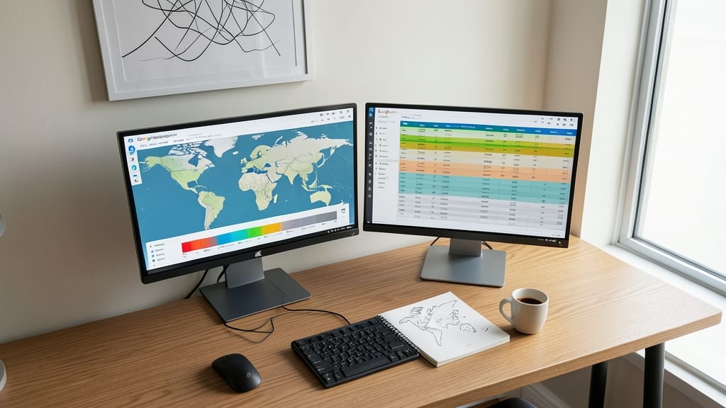
Want to turn your sales data into a strategic advantage without diving into complex GIS tools? Google Data Studio lets you overlay revenue figures onto maps with just a few clicks, revealing hidden patterns in customer concentration.
The geospatial visualization feature connects directly to Google Sheets or BigQuery, letting you pinpoint high-performing regions, underperforming areas, and seasonal trends. Custom color gradients highlight revenue density, while interactive tooltips display exact figures when you hover over locations. Best of all, it integrates with other Data Studio reports for a unified view—no coding required.
This is a game-changer for retail chains optimizing store placements or SaaS companies targeting regional customer growth. With zero setup beyond connecting your data source, you’ll spot opportunities faster than ever. ✨
AI-Powered Anomaly Detection in Python Dash

Tired of sifting through transaction logs for suspicious activity? Python Dash paired with scikit-learn’s Isolation Forest automates fraud detection by learning normal spending patterns and flagging outliers in real time.
Deploy a zero-config dashboard with pre-built ML models that highlight anomalies like sudden vendor overpayments or duplicate transactions. The confidence score slider lets you adjust sensitivity—ideal for balancing false positives and catching genuine red flags early. Integrate with QuickBooks or ERP systems via APIs for seamless data flow.
Perfect for accounting teams or fintech startups where manual reviews slow down approvals. Cut audit cycles by 60% while keeping compliance intact. ✨
Comparative Financial Benchmarking with Canva Infographics
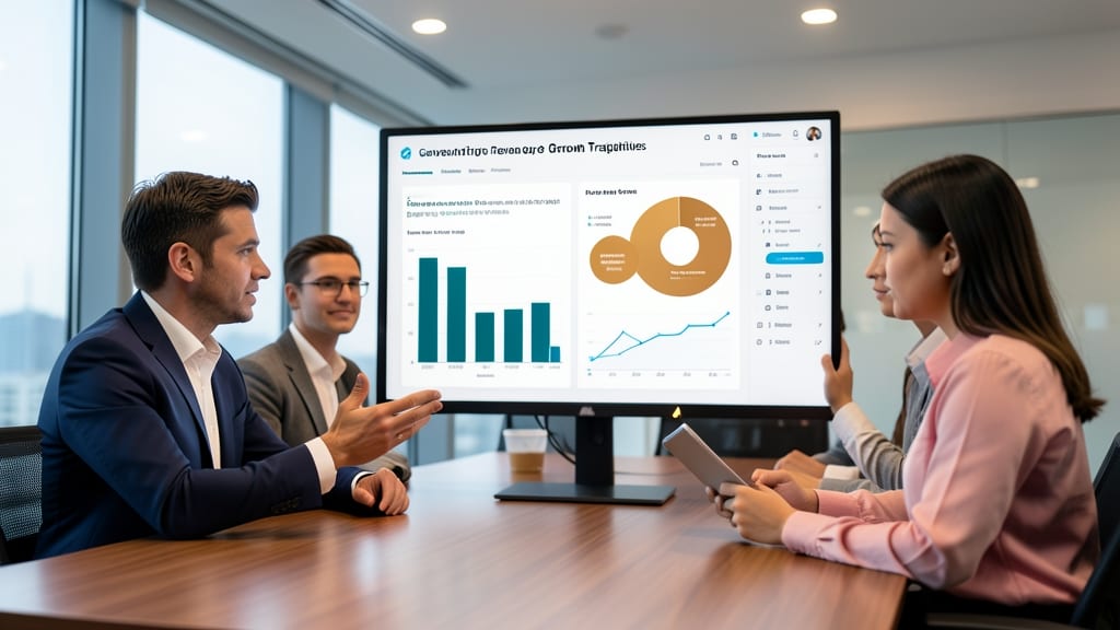
Pitching to investors or analysts? Skip the dense spreadsheets and let Canva’s drag-and-drop infographic tools turn competitor benchmarks into visually compelling narratives. With pre-built financial templates, you can instantly compare revenue growth, customer acquisition costs, or burn rates side-by-side using bold colors and icons that grab attention.
No design skills required—the Canva Pro library includes animated elements and export options for presentations or social media. Import your data from CSV or Google Sheets, then customize with real-time collaboration for team feedback. The mobile app ensures your infographics look sharp whether shared in a pitch deck or via email.
Startups and analysts will love how these shareable, one-page summaries replace hours of back-and-forth explanations. Perfect for fundraising decks or internal strategy meetings where clarity trumps complexity. ✨
Interactive Cash Flow Waterfalls in Excel 365

Tired of static cash flow reports that feel like reading a novel without pictures? Excel 365’s interactive waterfall charts turn financial modeling into a dynamic, hands-on experience—no coding required.
With drag-and-drop sliders, you can instantly adjust variables like revenue growth or cost reductions, watching the waterfall chart update in real time. The built-in sensitivity analysis tools let CFOs test "what-if" scenarios—such as a 10% revenue dip or a 5% cost increase—without manually rebuilding the entire model. Excel’s dynamic array formulas (like LET and LAMBDA) power the backend calculations, ensuring accuracy while keeping the interface intuitive.
Perfect for finance teams who need agility without complexity, this tool shines in boardroom presentations where stakeholders demand instant clarity. No need to switch to pricey third-party software—just leverage what’s already in your toolkit. ✨
Voice-Activated Financial Summaries with Alexa Skills

Tired of staring at spreadsheets during your morning commute? With Alexa Skills for Finance, you can turn your smart speaker into a hands-free financial assistant. Simply say, "Alexa, ask [Skill Name] for my quarterly profit trends," and get a natural-language summary—no screen needed.
The best skills integrate with QuickBooks, Xero, or Plaid to pull real-time data, then format responses like "Revenue grew 12% YoY, but R&D costs rose 8%—here’s the breakdown." Some even support custom dashboards where you can ask for comparisons like "How does Q3 compare to last year’s Q4?" The top-tier options (like Finch or MoneyLion) sync with 100+ financial institutions and offer multi-account tracking.
Perfect for executives, entrepreneurs, or anyone juggling multiple financial accounts, this approach turns passive listening time into productive insights—whether you're driving, working out, or just multitasking. ✨
Gamified Expense Tracking with Notion Dashboards

Tired of budgeting spreadsheets that collect dust? Notion Dashboards turn financial tracking into a motivational game—complete with progress bars, achievement badges, and customizable rewards that make saving money feel like leveling up.
You can embed real-time expense trackers with color-coded categories, set milestones for savings goals, and even add team challenges for nonprofits or finance coaching groups. The zero-code integration works with Google Sheets or bank APIs, while templates like "Savings Quest" or "Team Budget Battle" make it easy to deploy instantly.
Perfect for personal finance coaches or nonprofit teams who need to keep donors engaged—because who said budgeting can’t be fun? 🌟
AR Financial Walkthroughs with Microsoft HoloLens

Forget PowerPoint slides—when you need to sell a $50M commercial property deal, nothing beats Microsoft HoloLens transforming financial projections into a walkable 3D experience. Imagine stakeholders stepping inside a virtual building, where revenue streams flow like rivers and risk factors materialize as interactive holograms.
The HoloLens 2 projects high-fidelity 3D models directly into your workspace, letting you rotate cash flow projections, zoom into ROI timelines, or compare side-by-side scenarios with a gesture. Azure Spatial Anchors syncs the experience across devices, so your team can collaborate in real time—no VR headsets required. Developers use Unity or Unreal Engine to build custom financial AR apps, with hand-tracking controls for intuitive navigation.
This isn’t just flashy tech—it’s a game-changer for high-stakes pitches. Real estate developers, private equity firms, and infrastructure investors use it to close deals faster by making data tangible. For those who thrive on immersive storytelling, this is the ultimate tool. ✨